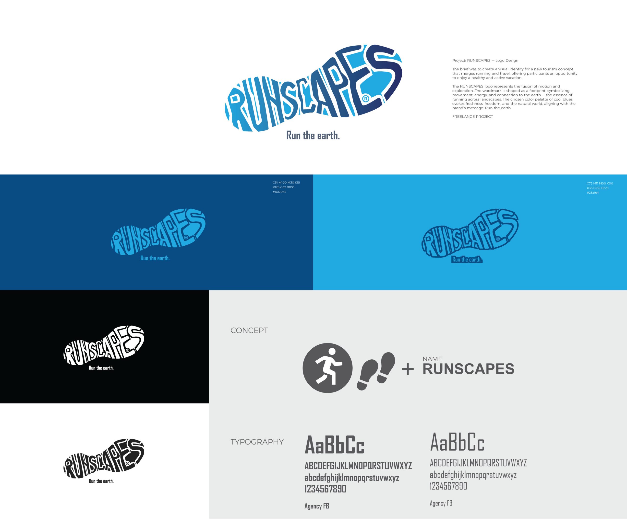
The brief was to create a visual identity for a new tourism concept that merged running and travel, offering participants an opportunity to enjoy a healthy and active vacation.
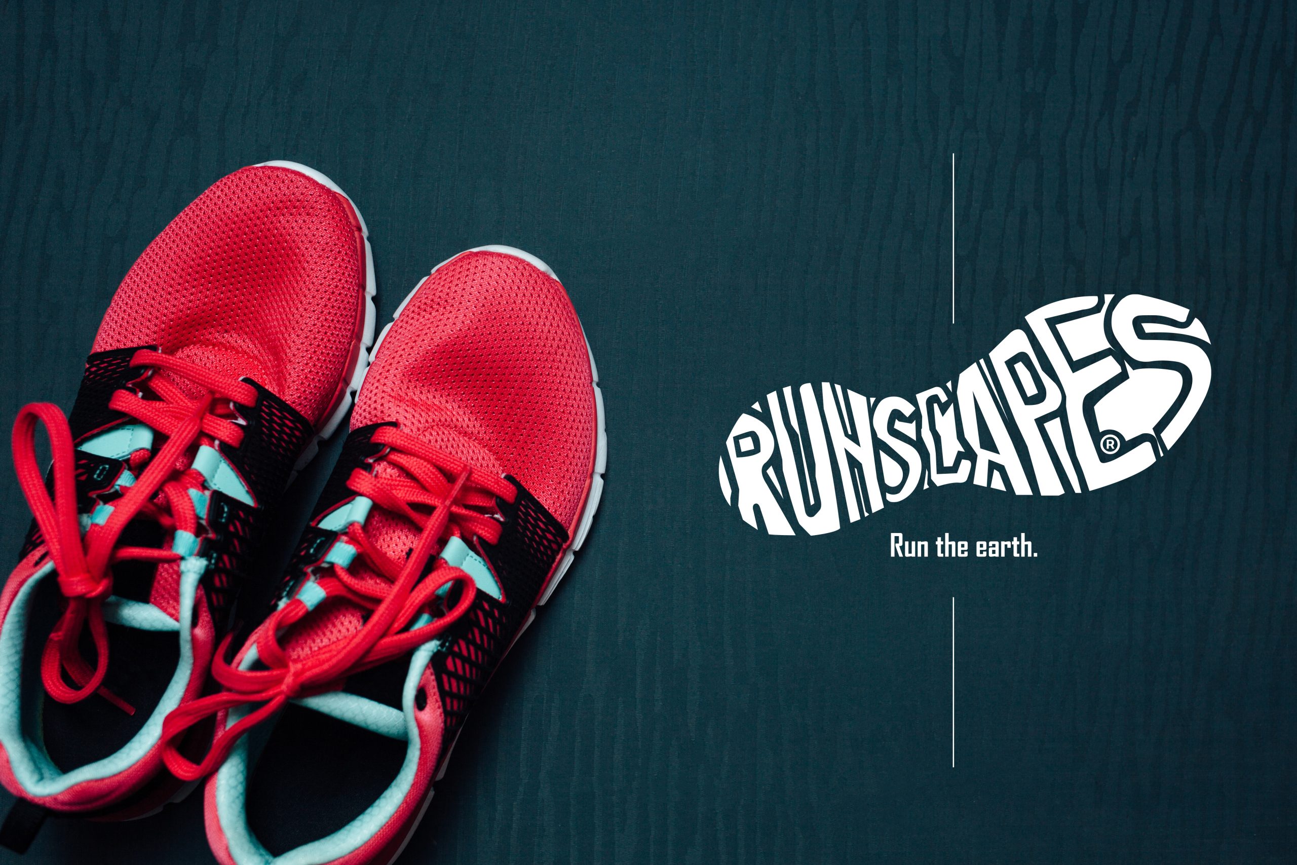
The RUNSCAPES logo represents the fusion of motion and exploration.
The wordmark is shaped as a footprint, symbolizing movement, energy, and connection to the earth — the essence of running across landscapes. The chosen color palette of cool blues evokes freshness, freedom, and the natural world, aligning with the brand’s message: Run the earth.
Freelance project